Here is a garden we built in Eynsham last year.
Our brief was to create a warm family garden for our client to enjoy with her grandchildren.
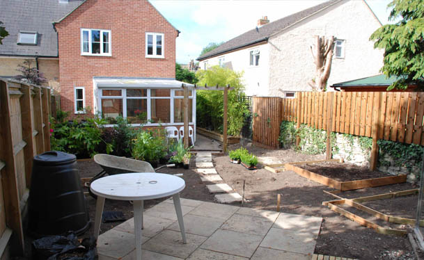
The space was closed off before with a fence and two large conifers, this left it feeling cut off from the house. We wanted the client, a concerned grandmother to be able to explore and play with the children in the garden. We felt that leaving the fence meant the client might not feel comfortable leaving the children to play in the space while not being able to see if they were ok from the house. Also the issue with restricted light from the trees made the space difficult to use.

We decided to cut the trees and remove the fence. The client expressed an interest in growing vegetables, and we suggested adding perennial areas to soften and add colour which she accepted. So we had several elements to add into our design: reusing materials on site, vegetable growing areas, perennial borders, a patio, a greenhouse, and shed.
As well as these ideas, I felt that I didnt want the space to be too open, I wanted a soft border between the house and the garden, this I wanted to achieve with shrub planting between the house and the upper garden, (this is not fully grown yet and so hard to show in the photos) the idea was that this would partially hide this new secret space from you, but also tempt you to go into the new upper garden. We wanted to reuse what materials we could, to be sustainable and to reduce costs, so we reused a pergola arch which had been down the side passage
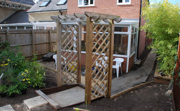
, we cut new slabs from old slabs to make small stepping stones across the lawn.
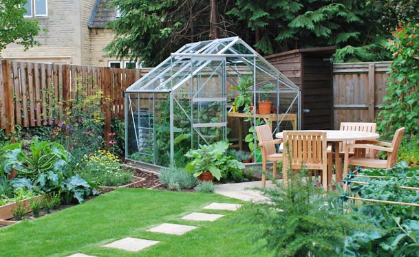
We reused the wood from the fence to make a new shed which fitted into a triangular space next to the greenhouse.
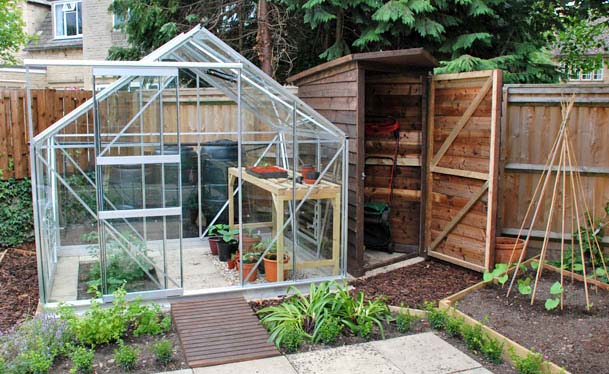
Primarily we took the greenhouse and made it a centre piece, ordering one which had the opposite proportions to the norm so the width of the front arched side, was equal to the side panels. This meant we could turn the greenhouse into the space, and use the point of the roof as a focal point in the garden.

The idea was to mix up a cottage garden containing box hedging borders and perennials and a kitchen garden so the greenhouse became the vertical counterpoint to the patio, providing enclosure and a sense of shelter, while vegetable raised beds were also mixed up with perennial beds.


It made sense to fit these elements together so they could compliment each other. I think this combining of working space and visually pleasing space, as well as reusing materials, allow this garden to feel contemporary, but also very homely.
Here is what our client had to say about it.
“I’m delighted with my new garden, designed and built by Doug and his colleague Sean. It’s only a small garden, but it’s been transformed, and has become a place that I want to spend time in, and enjoy. It’s like having another room in the house. An additional bonus was that we designed the new space to reuse and incorporate some of the materials that were already on site, including paving slabs, wooden sleepers and a pergola. I’m now busy growing vegetables in my new raised beds, and am looking forward to watching the garden grow as the new plants become established.” L Furnival
Here is a drawing from the design:


